Trying to reproduce a map of the greater Paris area from APUR with ggplot2, a moment for coloring
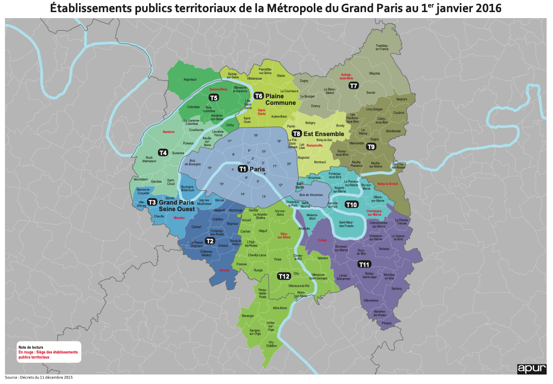
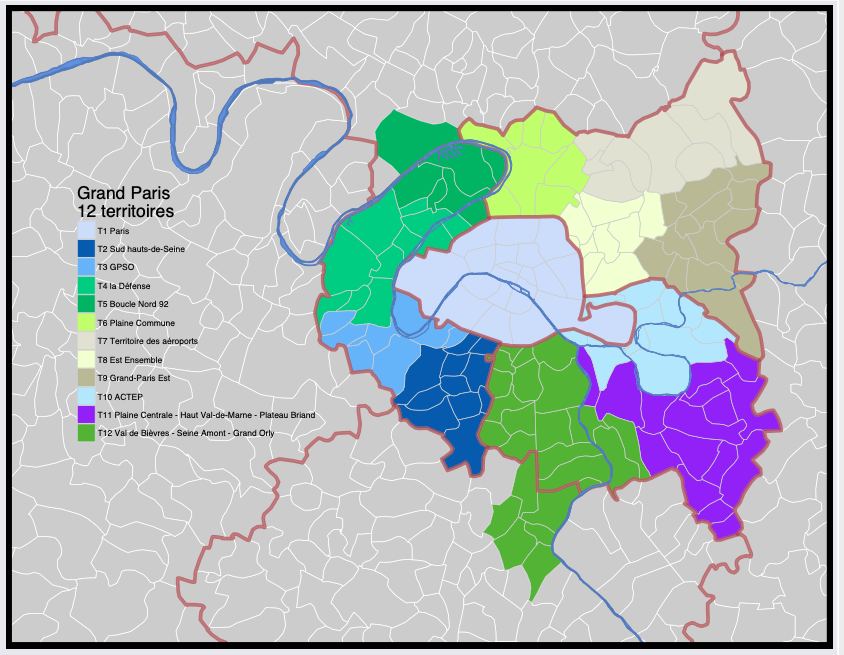
In 2016, APUR the Paris urbanism agency published a map that described new Greater Paris area, see here.
At this time I was interested to reproduce this map in R with official datas/shapefiles and ggplot2.
A moment for coloring.
I put this code story here to let it somewhere else than my head (I have lost part of the code since 2016) and to share.
Here is the map from APUR:
Trying to mimick with ggplot2
First thing was to define T1 to T12 areas (groups of cities) and use french national geographic institute (IGN) shapefiles to plot a beginning ggplot2 map:
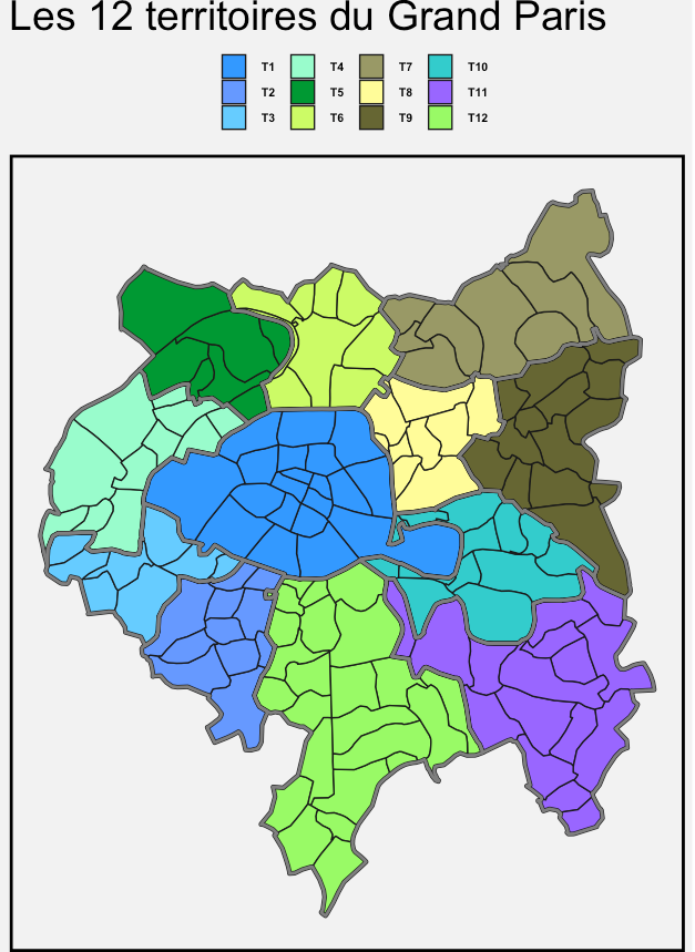
After some efforts, I was able to show this in R:
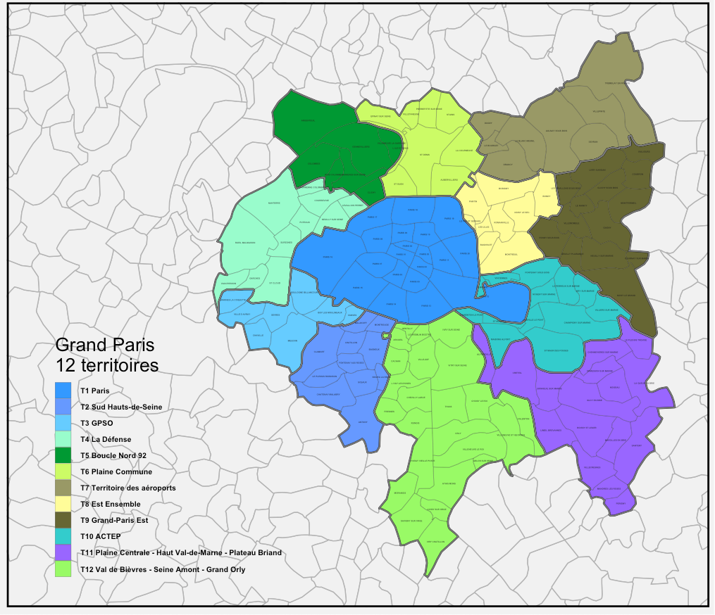
La Seine and co.
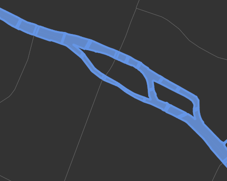
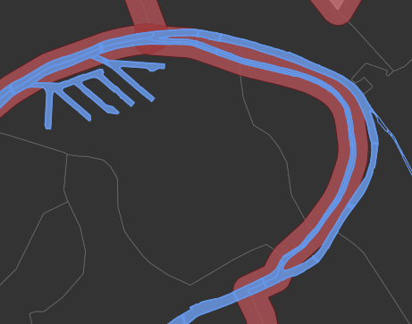
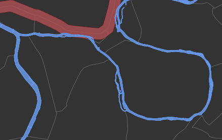
Last thing that was not shown are rivers and canals. I had to find a shapefile for this.
Fortunately, I have found a shapefile from APUR website directly, named PLAN_EAU.
With this data, I have been able to show La Seine, La Marne, le Port de Gennevilliers and Paris canals.
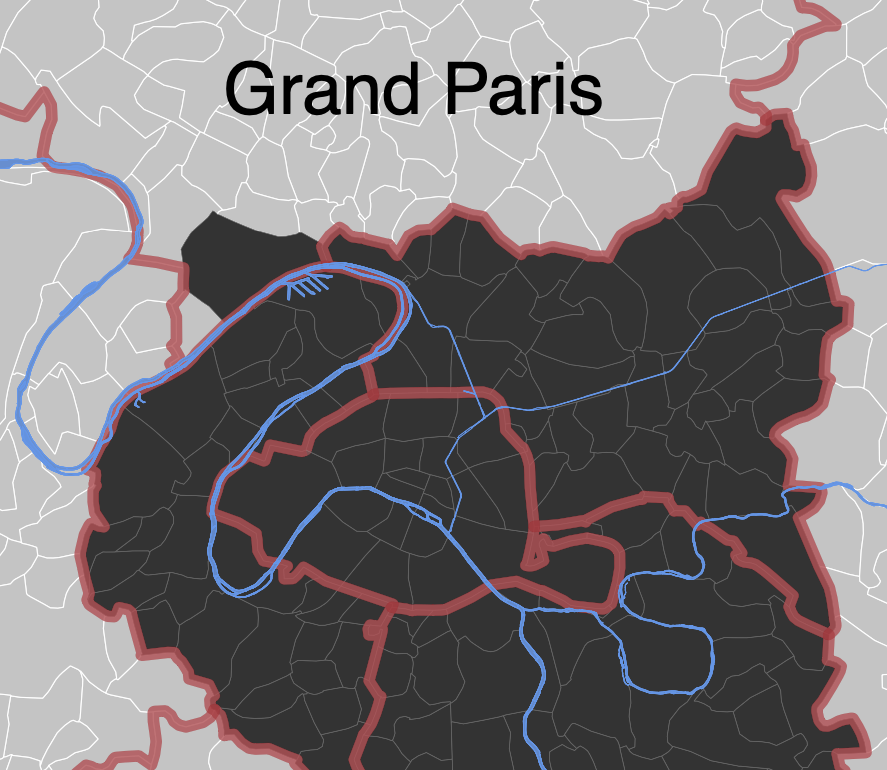
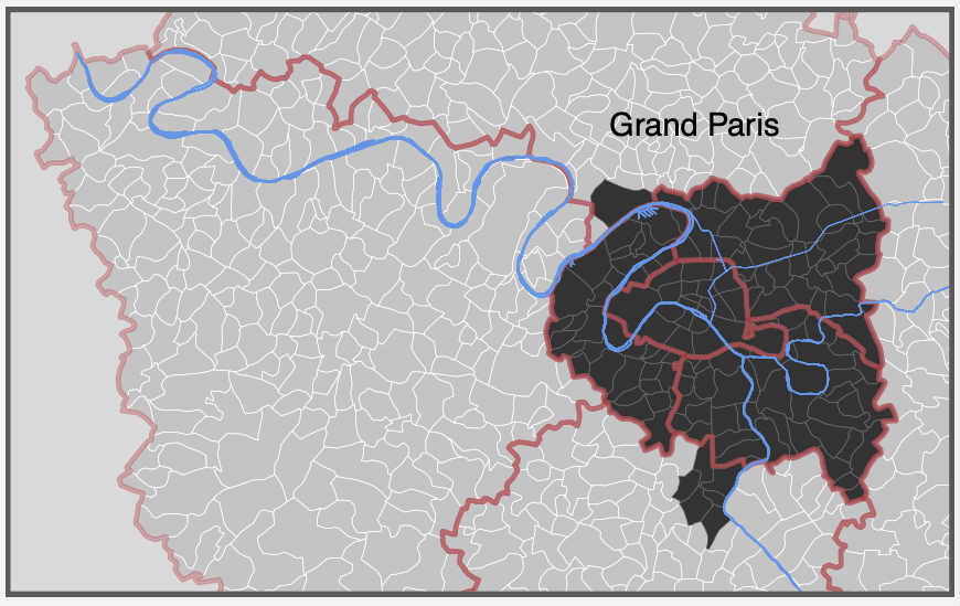
Here I have plotted Grand Paris with “carbon like” colors to highlight this new area and because I find it’s pretty cool like that!
R is really a nice environment.
See here in pdf
Greater Paris map with R
I was able to output something like this.
Code for these maps is not clean but is available here.
In this code, there are several steps:
- import shapefiles (rgdal)
- define Greater Paris area(s)
- union of regions with rgal/rgeos
- fortify shapefiles to plot polygons with ggplot2
- draw rivers and canals as polygons and paths (geoms)
Last map to mimick APUR map can be seen here in pdf.