Eyes on PCR tests with french open data -- COVID-19

Link for the app: https://guillaumepressiat.shinyapps.io/covid-si-dep
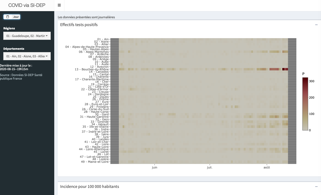
This app download daily csv file from french site data.gouv.fr via its api and build heatmaps updated with last day data available.
ggplot2withgeom_tileto plot heatmaps and interactivity withplotlyshinywidgetswithpickerInputto let user choose its departments- by tweeking URL like this, you can choose which ?departments or ?regions are available on startup:
https://guillaumepressiat.shinyapps.io/covid-si-dep/?reg=11|93|32
https://guillaumepressiat.shinyapps.io/covid-si-dep/?dep=36|23|75|29
Data availables are:
- Number of positive tests by day, week and departments
- Incidence of positive tests for 100 000 inhabitants
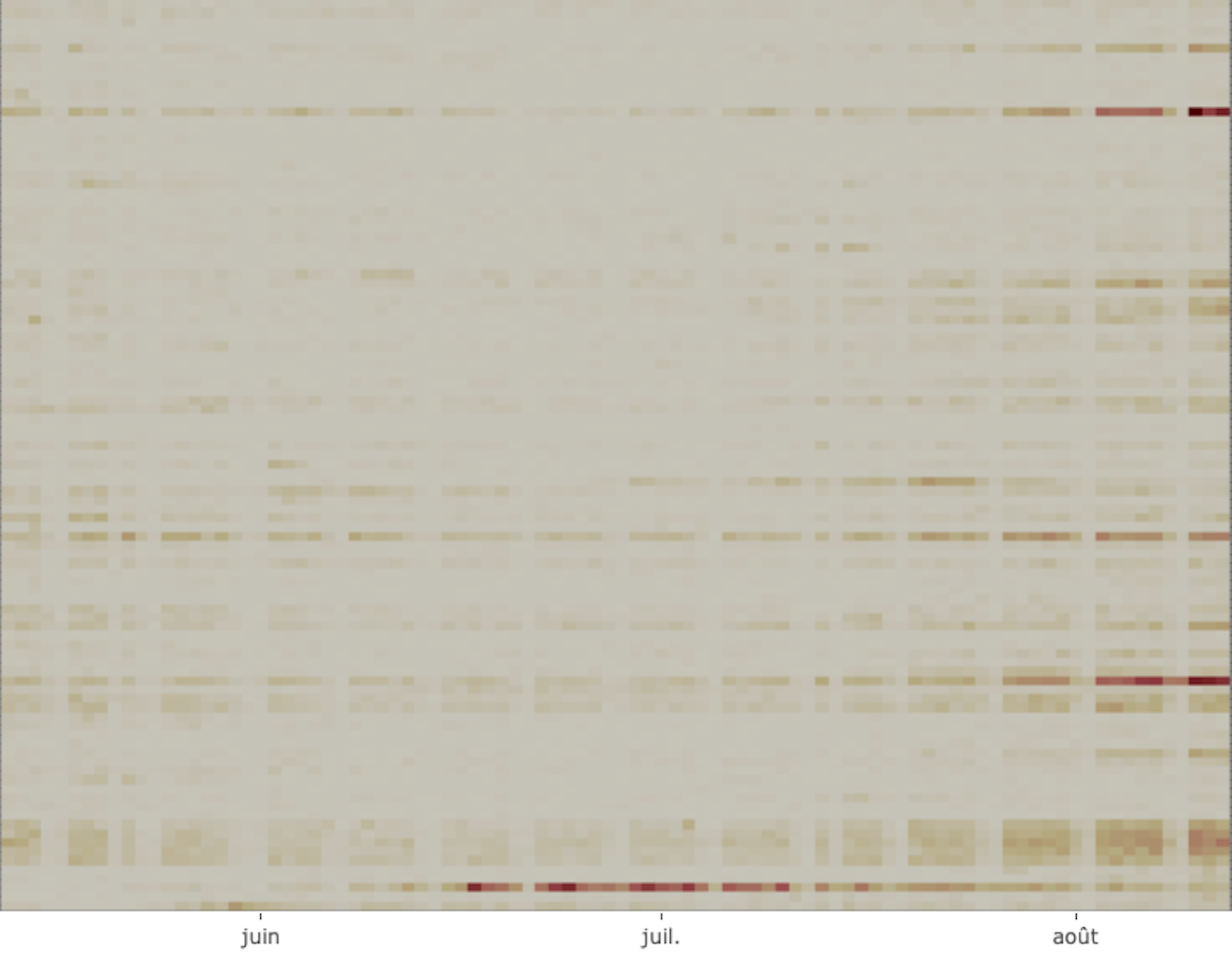
The idea is to follow horizontally tendancies for each department and to see easily which ones have a particular kinetic. You can also compare departments with incidence heatmap lower on screen. Whereas in covidfrance app, we see indicators day by day in animation, here we want to see time and epidemic effects in the same frame.
At day scale we can see weekdays and week-ends appears in data.

Code for this app is quick code available here.
Like the precedent app, this one is limited on few indicators to keep user mind focused (one app, one goal). Then first advantage is that app will be simple to update if necessary (no nebulous code), not a bad thing in these times.
Once again it’s quite a good thing to have these data available as open data (Santé Publique France data) for people and journalists. Source is here.