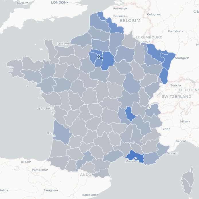
Eyes on first wave with french open data -- COVID-19
Covidfrance app was first developped beginning of April for family, friends (and myself) to automatically know every day how many cases there are in each department where they live, daily along this crisis.
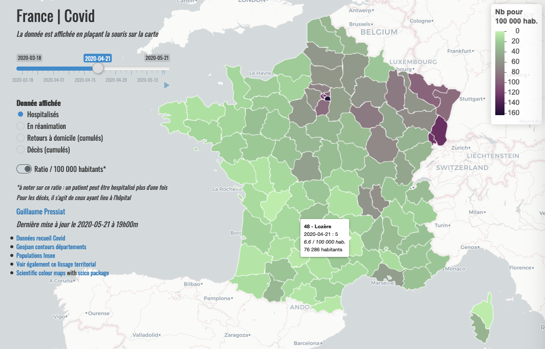
This app download daily csv file from french site data.gouv.fr via its api and build the map updated with last day data.
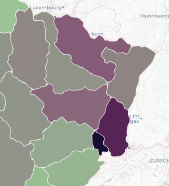
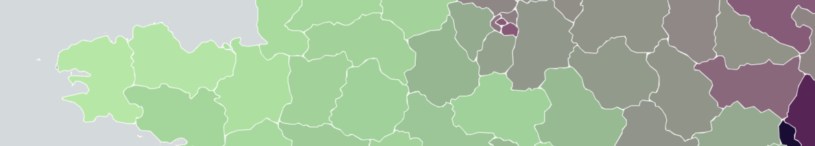
- Scientific colour maps palettes are used with scico package
- Population’s ratio statistics are enabled with a switch to have both absolute and relative measures of epidemy.
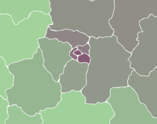
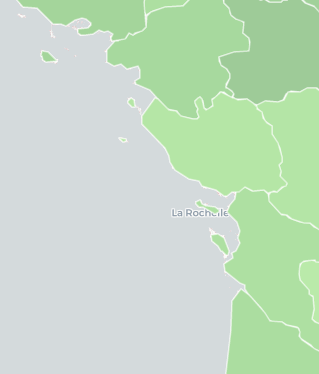
- Overlay of json layers is used with full opacity to render time progression visible
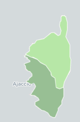
- departments shapes are simplified and smoothed with smoothr (Chaikin method) and rmapshaper, really nice packages
- to let the map prints each day on animated mode along the time gauge, a delay of 1.7 second is set. It’s a bit long but there are ~ 100 departments to look up each day! (“Almost 2 sec per day, not so much”).
Data availables are:
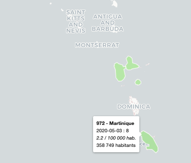
- Hospitalisés: people in hospital on day i
- En réanimation: people in intensive care unit on day i
- Retours à domicile (cumulés): cumul of returned at home until the day i
- Décès (cumulés): cumul of deceases at hospital until the day i
This open data csv is a good way to share data across data-focus people and journalists.
Then an app like this seems a good way to make data more accessible and eye friendly for people, with a geographical and “kinetic” approach.
Code for this app is quick code available here.